


Branded Payment Pages: Build Customer Trust Before They Pay

Why Your Payment Page Should Feel Like Your Business
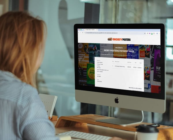
Sending a customer a payment link should make payment feel simple, clear and safe. But if the page they land on looks nothing like your business, it can create doubt at the exact moment you want them to pay.
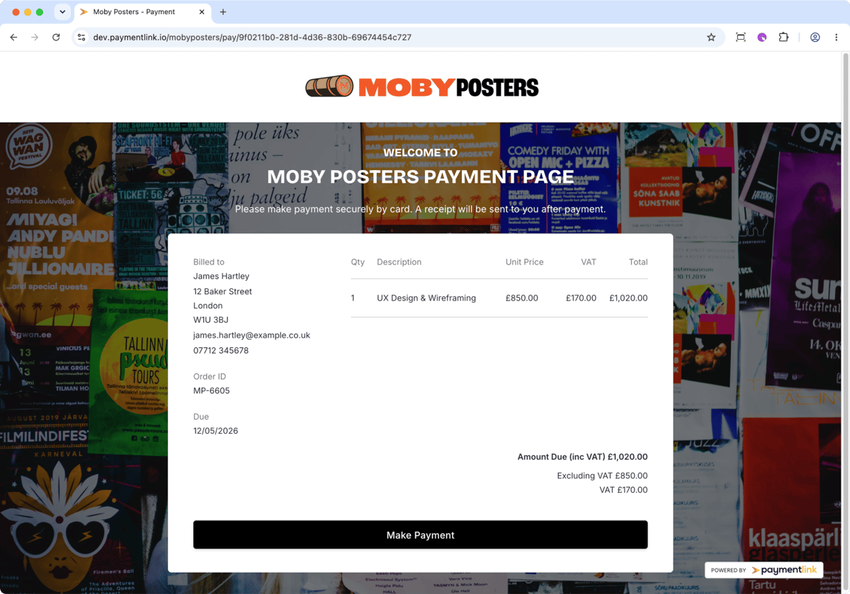
A branded payment page helps solve that problem. When your customer sees your logo, trading name, colours, wording and familiar payment flow, they get a clear signal that they are paying the right business. It feels less like a random third-party form and more like a natural part of your own customer experience.
That matters because online payments are built on confidence. Customers are often cautious when entering card details, especially if the page looks generic, unfamiliar, or disconnected from the business they expected to pay. Trust is not only created by what you say. It is also created by what your payment page shows at the moment of payment.
Payfast discusses the trust signals customers look for throughout the online buying and checkout experience. GoCardless also highlights the importance of clear, secure and convenient online payment options when building customer trust.
PaymentLink.io gives small businesses, freelancers, social agencies, tutors, tradespeople, print shops and service providers a practical way to create branded payment links and payment pages without building a full checkout system from scratch. You connect your own Stripe account, create payment links, customise the payment experience, and let customers pay online by card, Apple Pay or Google Pay, where supported. Where available, you can also point a custom subdomain pay.mycompany.com to your payment page. This makes the payment link feel more like your own website and can significantly improve customer confidence because the URL, page design, and business identity all align.
Why unbranded payment links can make customers hesitate
A payment link is often sent after a conversation, quote, booking, invoice, session or order. The customer may have spoken to you on WhatsApp, received an email from your business, or agreed on a price over the phone. Then they click the payment link.
If the payment page suddenly looks unrelated to your business, a few questions can appear in the customer’s mind:
- Is this definitely the same company?
- Why does this page look different from the business I was speaking to?
- Am I paying the right person?
- Is this a secure checkout or a random form?
Even if the payment page is technically secure, the visual experience can still feel disconnected. A plain white form, an unfamiliar name, a missing logo or a generic button may be enough to slow the customer down.
That pause matters. When a customer is ready to pay, you want as little friction as possible. A branded payment page reassures them before they enter their details. It confirms the business identity, keeps the journey consistent and makes the payment feel intentional.
This is not only about design. It is about reducing doubt.
What is a branded payment page?
A branded payment page is an online payment page that reflects your business identity. Instead of sending customers to a generic payment form, you send them to a page that includes your logo, business name, brand colours, button styling, wording and page layout.
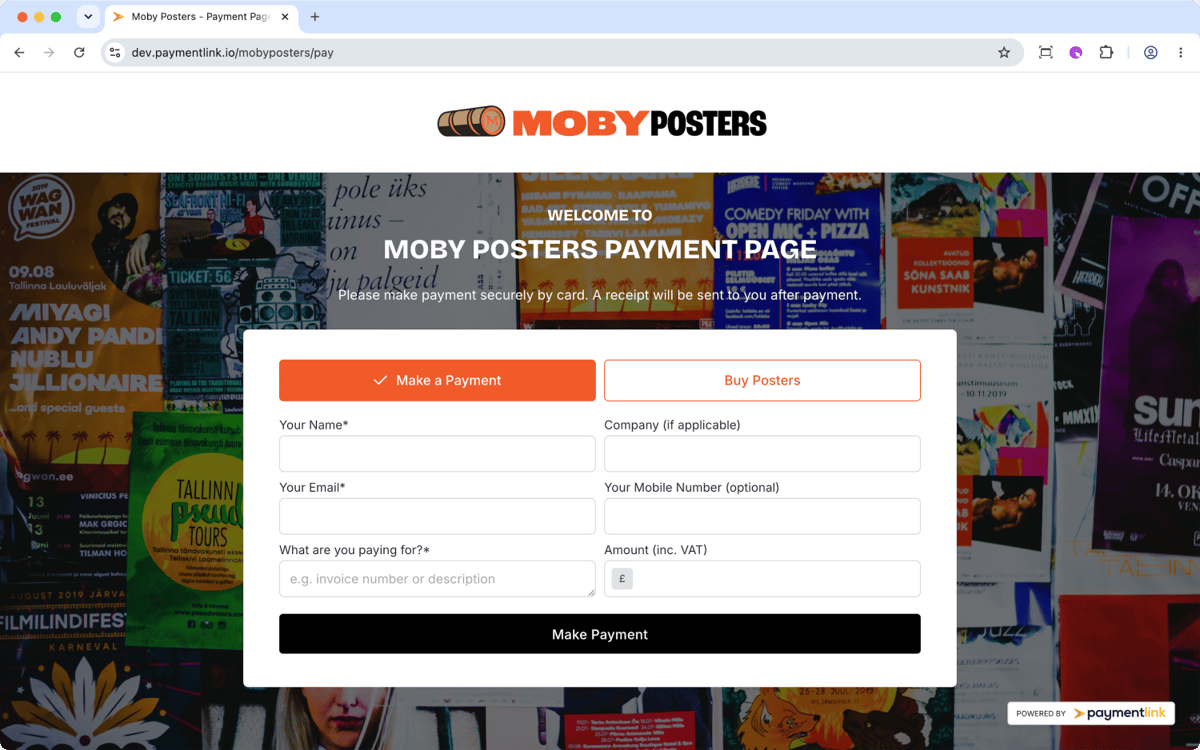
For example, a graphic designer could use a branded page with their studio logo, soft background colours and a clear “Pay Design Deposit” button. A tutor could use a simple page featuring their trading name and a friendly payment message. A print shop could add a bold, branded background and clear wording for custom print orders.
The goal is simple: when the customer lands on the payment page, it should feel like your business.
That feeling becomes even stronger when the page can sit on a custom subdomain such as pay.mycompany.com. Instead of seeing a payment page that feels separate from your website, the customer sees a payment URL that looks connected to your own brand.
A branded checkout experience usually includes recognisable identity elements such as logos, colours and typography. ConnectPay describes branded checkout as a customised checkout process that reflects a business’s logo, colour palette, typography and messaging, rather than redirecting customers to a generic third-party payment page.
Why your logo and colours build payment trust
Customers use visual signals to make quick decisions. They may not think, “This page is branded, so I trust it.” But they do notice when something feels consistent.
Your logo confirms who they are paying. Your colours make the page feel familiar. Your wording explains what will happen next. Your button labels guide the action. Your email and PDF templates continue the same identity after payment.
This consistency can make the difference between a customer thinking “I’ll pay this now” and “I’ll check this later.”
A branded payment page helps because it:
- Confirms the business identity before payment.
- Makes the page feel connected to the email, invoice, WhatsApp message or quote.
- Reduces the “wrong page” feeling that generic forms can create.
- Makes the business look more professional.
- Gives the customer a clearer reason to complete the payment now.
For small businesses, this is especially important. You may not have a large brand name that customers instantly recognise. Your payment page needs to do some of the reassurance work for you.
How PaymentLink.io helps you create a branded payment experience
PaymentLink.io makes branding part of the payment journey, not an afterthought.
The branding section lets you customise the look and wording across your payment experience, including your Payment Link page, 24/7 Payment Page, Micro E-commerce shop and QR Code page. The official branding overview guide explains how branding applies across the Payment Page, email templates, PDF templates and QR Code page.
That means your customer can see a consistent brand whether they are:
- Clicking a payment link sent by email or WhatsApp.
- Visiting your permanent payment page.
- Opening a payment page on a custom subdomain such as
pay.mycompany.com, where available. - Buying from your simple shop page.
- Scanning a QR code in person.
- Receiving a branded email after payment.
- Downloading a PDF invoice or receipt.
This is where PaymentLink.io stands out for businesses that want to get paid faster without sending customers to a plain, disconnected payment form.
Use a custom subdomain to make payment feel part of your website
Branding is not only what appears on the page. The payment page URL also affects how trustworthy the experience feels.
With PaymentLink.io, users can use a permanent business URL and, where available, point a custom subdomain to their payment page. For example, a business could use pay.mycompany.com instead of sending customers to a URL that feels separate from the rest of the brand.
This can significantly increase customer confidence because the customer sees a payment address that looks like part of your own website. The logo, colours, payment text and domain all work together to confirm that they are paying the right business.
For service businesses, this is especially useful when payment links are sent by WhatsApp, SMS, email or social media. A link that starts with your own payment subdomain can feel more familiar than a generic third-party link, which can reduce doubt before the customer reaches the payment form.
1. Upload your logo and show the right business name
The logo is one of the first trust signals on a payment page. It tells the customer, “You are in the right place.”
In PaymentLink.io, you can upload your logo and control how it appears across your payment pages. If you do not have a logo yet, your business or display name can still appear by default. The logo setup guide explains how users can upload a logo, update the display name and publish changes before they go live.
This is useful for businesses that trade under a slightly different public name from their legal or account name. For example:
- A limited company may trade under a shorter studio name.
- A tutor may want their teaching brand shown instead of their full legal name.
- A print shop may want customers to see the shop's trading name, which they recognise.
- A freelancer may want the page to show their brand rather than a personal admin name.
A logo and clear trading name remove uncertainty. Customers are more likely to complete payment when they can instantly recognise who they are paying.
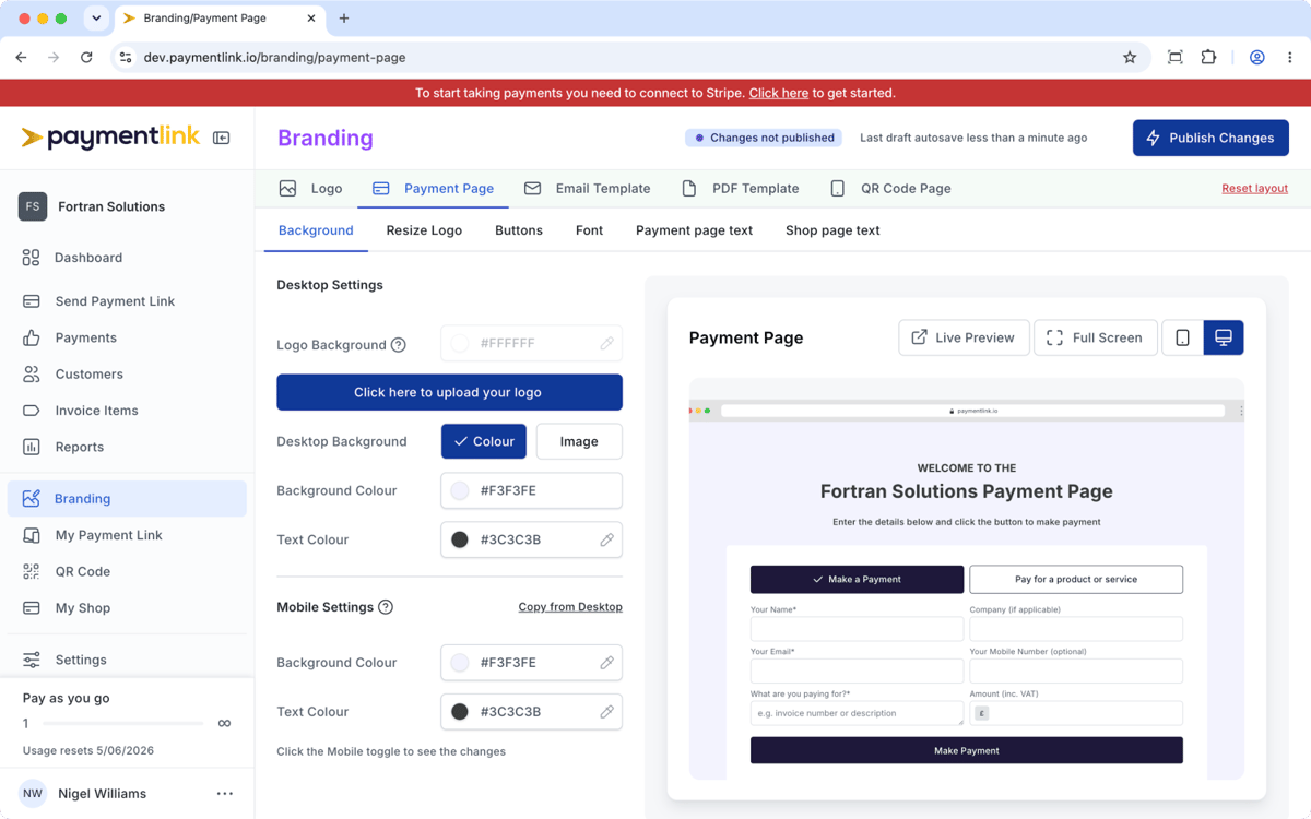
2. Customise the payment page background
The background sets the mood of the page. It can make your payment page look clean and minimal, bold and creative, or warm and service-led.
PaymentLink.io provides desktop and mobile background controls so the page looks good on both large screens and phones.
For the desktop, you can choose a background type. You can use a simple colour background, add a background image, choose from freely available images, use one of the available patterns, or upload your own image. You can also control the text colour to keep the content readable.
For mobile, you can set the background colour and text colour separately, or copy the desktop colours to keep the setup quick.
This matters because many customers open payment links on mobile. A background that looks good on a desktop may not always work on a phone screen. PaymentLink.io gives you control over both, so your payment page can stay readable and professional wherever the customer clicks.
3. Resize your logo so it looks right
A logo that is too small can be missed. A logo that is too large can overpower the payment form.
PaymentLink.io includes an easy logo resize option that uses a drag slider to adjust the logo size on the payment page. This is a small detail, but it makes the page feel more polished.
For example, a wide logo may need to be slightly smaller to fit neatly in the header. A compact icon logo may need to be larger to be instantly recognisable. A service business using a wordmark may want it centred and balanced above the payment form.
The point is not just to “add a logo.” The point is to make the payment page feel intentionally designed.
4. Style your buttons and change the button text
Buttons are among the most important elements of a payment page because they tell the customer what to do next.
With PaymentLink.io, you can customise the main button background colours and text colours so the call to action matches your brand. You can also change button labels so they use wording that fits your business and payment type. The payment page buttons guide explains how to adjust button styling and labels.
Instead of a generic “Submit” or “Continue,” you can use clearer, more specific button text such as:
- Make Payment
- Pay Invoice
- Pay Deposit
- Book and Pay
- Pay for Session
- Buy Posters
- Pay for Lesson
- Complete Payment
This makes the payment action feel more natural. A customer paying a tutor for a lesson sees wording that matches the service. A client paying an agency retainer sees a direct payment action. A print customer paying for a custom order sees a relevant button rather than a generic checkout label.
Small wording changes can reduce hesitation because the customer understands exactly what happens when they click.
5. Choose fonts that match your brand
Typography affects how professional a page feels. A premium consultancy may want a clean, polished font. A creative studio may want something more distinctive. A tutor or personal trainer may prefer a friendly, simple style.
PaymentLink.io lets you choose from hundreds of Google Fonts to customise your payment page headings. The payment page font guide explains how users can choose from a selection of Google Fonts and publish changes to make them live.
This helps your payment page feel more in line with your website, social pages, and customer communications. The payment page is not just a payment tool. It is part of your brand experience.
6. Customise the payment page text
Generic page text often feels cold. Branded payment page text can be clearer, warmer and more useful.
PaymentLink.io lets you customise the text shown on the payment page. The payment page intro text guide explains how businesses can edit the wording customers see before they pay.
This gives you room to explain what the customer should do, what they are paying for, and what happens after payment.
For example:
Please enter your invoice number or booking reference below. Once payment is complete, your receipt will be sent by email.
Pay securely for your design deposit. Once we receive it, we will confirm your project start date.
Use this page to pay for your tutoring session. Please include the student's name in the description box.
This type of wording does two things. It reassures the customer, and it reduces admin questions for the business.
7. Customise your shop page text
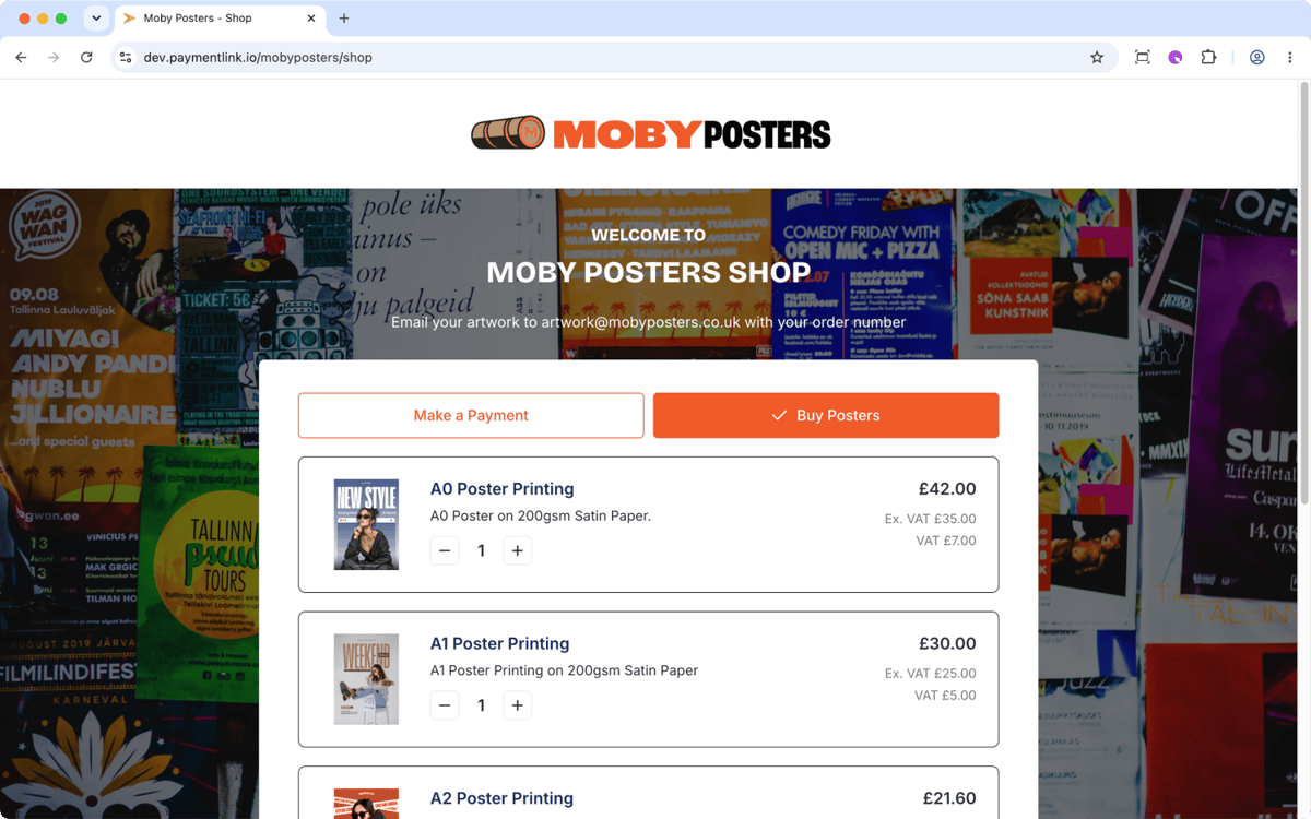
PaymentLink.io is not only for one-off payment links. It also supports a micro e-commerce page where businesses can list fixed-price products or services.
This is useful if you sell repeatable services or simple product options, such as:
- Tutoring lesson blocks.
- Personal training sessions.
- Poster printing sizes.
- Design packages.
- Workshop tickets.
- Fixed-price consultations.
- Driving lesson bundles.
The shop page text can be customised so the page feels like a small branded online shop rather than a generic product list. The branding overview guide explains that the Micro E-commerce module is the online shop and has a dedicated URL that can be shared.
For small businesses that do not want to build a full e-commerce website, this is a practical way to sell online while maintaining a branded experience.
8. Customise email templates
The payment experience does not stop when the customer clicks pay. Emails also affect trust.
PaymentLink.io lets you customise email template branding, including the logo size and header colour. This helps the customer recognise your business when they receive a payment email, a payment request, or a confirmation.
A branded email is better than a plain message because it continues the same identity from the payment page. The customer sees the same business name, logo style and colours, which makes the whole process feel more professional.
For businesses that rely on email payment requests, this is especially useful. A customer may receive a payment email after a quote, job, session or order. If the email looks official and branded, they are less likely to ignore it or question its authenticity.
9. Customise PDF templates
PDFs are still important for many customers. Some want a record for their accounts. Some want a receipt. Some businesses still need invoice-style documentation alongside online payment.
PaymentLink.io lets you adjust logo sizing on PDF templates so the downloaded document looks consistent with your brand.
This is helpful for:
- B2B clients that need documentation.
- Agencies are sending project payment requests.
- Print shops are sending order confirmations.
- Consultants sending receipts.
- Tutors or trainers keep payment records for clients.
A branded PDF makes the payment process feel more complete. It shows that the payment was not only collected but also handled professionally.
10. Customise the QR code page
QR code payments are useful when the customer is with you in person. They scan, open the page on their phone and pay without needing a physical card machine.
PaymentLink.io allows customisation of QR code page text, so the mobile payment page can explain what the customer should do.
For example:
Scan to pay for today’s session.
Please enter your order number before paying.
Pay securely by card using this QR code.
The branding overview guide explains that the QR Code module uses the mobile theme with a solid background colour to help legibility.
That detail matters because QR payments usually happen quickly. The customer may be standing in a shop, at a counter, in a class, at an event or after a session. The page needs to be clear, readable and easy to trust on a phone.
Branded payment page examples by business type
A branded payment page is useful across many industries, but its value varies slightly depending on the business.
Freelancers and agencies
Freelancers often send payment requests for deposits, milestones or final balances. A branded payment page makes a solo business look more established and professional.
A designer could use a branded deposit page with their logo, portfolio-style colours and a button labelled “Pay Design Deposit.” An agency could use a clean branded page for retainers, ad spend top-ups or monthly service payments.
This feels better than asking the client to pay via bank transfer and then manually checking whether the money has arrived.
Tutors and coaches
Tutors, coaches and instructors often collect repeat payments for sessions. A branded payment page can make the process feel simple for parents, students or clients.
The page text can ask for the student's name, the lesson date, or the session reference. The button can say “Pay for Lesson” or “Pay for Session.” The page can use soft, friendly branding rather than a plain payment form.
Trades and service businesses
Tradespeople can use branded payment links after a job, before ordering materials, or when collecting a deposit. The customer can see the business name, logo and clear payment amount before paying.
This is useful when the payment link is sent by SMS or WhatsApp. The branded page reassures the customer that the link belongs to the tradesperson they were dealing with.
Print shops and custom order businesses
Print shops often deal with custom amounts, itemised orders and repeat customers. A branded payment link can show the customer what they are paying for, while the payment page can match the shop’s visual identity.
A shop page can also list fixed products such as poster sizes, flyers, business cards or design add-ons.
Retail and small product sellers
A full e-commerce site may be too much for a business with a small set of products or services. PaymentLink.io’s micro e-commerce page gives the business a simpler branded way to list items, let customers choose and take payment online.
Branded payment pages help customers pay more quickly because they remove doubt
Getting paid faster is not only about sending a link quickly. It is about sending a link that the customer is comfortable clicking and completing.
A generic payment link can technically work, but it may not remove enough doubt. A branded payment page helps answer the silent questions a customer has before paying:
- Is this the right business?
- Does the payment URL look connected to the business website?
- Is this payment request meant for me?
- Does the page look professional?
- Do I understand what I am paying for?
- Do I know what happens after I pay?
When your payment page answers those questions visually and clearly, customers have fewer reasons to delay.
PaymentLink.io streamlines payment link creation, payment page branding, QR payments, micro e-commerce, and payment records into a single, practical workflow. The branding overview guide also notes that customers can land directly on the Payment Link page from WhatsApp or messaging apps, or through an email payment button.
Branded payment page vs generic payment form
A generic payment form can be useful when speed is the only goal. But for customer-facing small businesses, the payment experience is also part of the relationship.
| Generic payment form | Branded PaymentLink.io payment page |
|---|---|
| May not show your logo clearly | Shows your business identity |
| Can feel disconnected from your website or message | Feels like part of your business |
| May use a URL that feels separate from your brand | Can use a custom subdomain such as pay.mycompany.com, where available |
| Uses standard wording | Let's you customise payment and shop text |
| Limited visual control | Allows brand colours, backgrounds, logo sizing and fonts |
| May create customer hesitation | Helps reassure customers before payment |
| Usually, it only handles one payment experience | Supports payment links, 24/7 payment page, QR code and micro e-commerce |
The difference is not decoration. The difference is confidence.
Why PaymentLink.io is a strong choice for branded payment pages
PaymentLink.io is built for businesses that want to get paid online without turning payment collection into a complicated technical project.
It is a strong fit if you want to:
- Create branded payment links.
- Send payment requests by email, WhatsApp, SMS or messenger.
- Let customers pay by card, Apple Pay or Google Pay through Stripe, where supported.
- Use your own logo, colours, button text, background and fonts.
- Create a dedicated payment page that customers can visit 24/7.
- Use a custom subdomain such as
pay.mycompany.com, where available, so the payment page feels closer to your own website. - Add a simple shop page for fixed-price services or products.
- Take in-person payments using a QR code.
- Keep the customer payment journey clear and on brand.
The branding overview guide explains that the dedicated Payment Page is open 24/7 and that users can either use a permanent business URL or a custom domain where available. A custom subdomain such as pay.mycompany.com can make the payment journey feel more connected to your main website and brand.
For a small business, that means you do not need to choose between a plain payment link and a full online store. PaymentLink.io gives you the middle ground: a branded payment experience that is easier to set up, easier to share and easier for customers to trust.
Common mistakes to avoid with payment page branding
Using a logo that is too small
If customers cannot see your logo clearly, it loses its value. Resize it so it is visible without taking over the page.
Choosing colours with poor contrast
Brand colours are useful, but the page must still be readable. Make sure text, buttons and form areas are clear on both desktop and mobile.
Keeping generic button labels
Button labels should match the customer’s action. “Pay Deposit” or “Pay Invoice” is often clearer than a vague default label.
Forgetting mobile users
Many customers open payment links on their phones. Check the mobile version, not just the desktop preview.
Leaving the intro text unchanged
Payment page text is an opportunity to reassure the customer. Use it to explain what they are paying for and what happens next.
Final thoughts
A branded payment page helps customers feel confident before they pay. It shows your logo, your colours, your wording and your business identity at the moment when trust matters most.
For small businesses, this can make online payment collection feel more professional, more familiar and less awkward. Instead of sending customers to a generic payment form, you can send them to a branded payment experience that looks like your business and helps them understand exactly what they are paying for.
PaymentLink.io gives you the tools to do this without having to build a checkout from scratch. Upload your logo, choose your colours, customise your background, adjust your buttons, select fonts, edit payment text, brand your emails and PDFs, connect a custom subdomain where available, and create a payment journey that feels clear from link to receipt.
When customers trust the page, they are more likely to complete the payment.
Ready to create a branded payment page?
Create a branded payment page with PaymentLink.io and make it easier for customers to pay with confidence.
We’re fanatical about your success.
Start with a 30-day free trial - no restrictions, no monthly commitments or tie-ins.Start changing the way you take payments and make your life easier.


